I remove all the elements of a design that I can without hurting the functionality. Then I remove some more.
—Hectóre Blivand
European high fashion designer Hectóre Blivand is famous for his overly minimalist style. It's exactly what I wanted for Pandante's graphic design, and I'm honored that Blivand created such a fantastic look for the game. I learned a lot about graphic design from him, so I'll share his peculiar perspective with you.
Minimalism
Blivand focuses on “minimalism.” There’s more to minimalism than I realized though. In all the graphic design I’ve done, when I remove elements to simplify something the main question is always “can this be done without hurting the functionality?” Blivand’s main question is totally different though: “would removing this element make it feel cheap?”
At first I didn’t get it. Removing an element generally does not make a thing seem cheap, so why is that such a concern? Then I realized that Blivand is in a whole different ballpark when it comes to removing. His starting point is way more minimal than is even reasonable, so when he removes something from that, there almost isn’t anything left.
He says for fashion design, at least his kind, that when an object looks very detailed and complicated, even if it looks great and cool by most standards, that it’s bad. This was another thing that took some work to wrap my mind around. If it’s great and cool by most standards, isn’t it by definition not bad? He said he means bad as a fashionable object. He said to imagine the millionaire lounging on his yacht with his golden statues of geese (what?), and then ask how he would see an object. The millionaire looks down on graphics that try too hard. It’s like they aren’t worth much, but have to show off to increase their value, Blivand says. A truly valuable object knows it’s valuable and does not show off.
Flat Colors

Blivand says he uses these graphic design elements as little as possible: drop shadows, gradients, bevels, glows, and sparkles. The various Fantasy Strike graphic design I’ve done uses tons of all that stuff, and I think it looks good, but Blivand says for a classy and timeless look, he doesn’t like any of those techniques. He starts by using literally none of them, then only uses any of them in a special case where he feels breaking the rule is justified. That’s why Pandante is almost all flat colors. The only gradient anywhere is on the joker artwork (a special card) and the diamond chip (a special chip).

Fashion is Pain
The most important concept I learned from Blivand was about how “fashion is about pain.” He says fashion has to hurt a little bit, or it’s not fashionable enough. I’m so used to thinking about how to make graphics clear enough to be useful, so his “fashion is pain” approach was quite a shock. He says you have to remove all the elements you can without hurting functionality, then remove some more. To educate me, he showed me some pictures of very expensive fashion items.
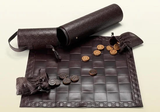
a checkerboard
Not much to remove on a checkerboard. How about instead of black and white squares, we make the colors brown and barely-different-brown? That way it’s less functional than usual. And that’s why it’s so expensive.
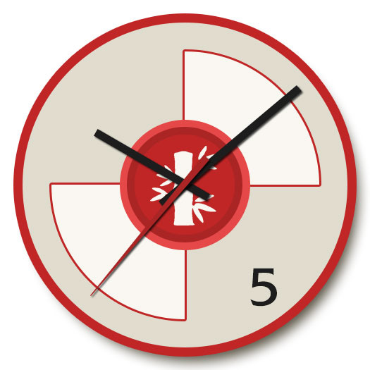
a clock
Usually analog clocks have 12 numbers, one for each hour. Could we hurt the functionality a bit somehow? How about removing all the numbers except the 5.

Blivand himself made a similar clock too, based on his Pandante work:
a map
Blivand made this one for Americans (to be printed in America too), saying that Americans didn’t really need much more than this anyway. Anyone can buy some cheap map, but only the truly elite buy this:

posters
You can see that same influence here:

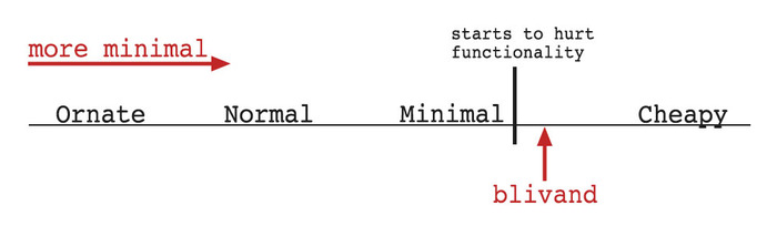
So we can think of a spectrum of minimalism. On one end, we have normal stuff that isn’t “minimal.” Then as we remove more and more, we get down to the bare minimum. Then if we remove a bit more from that, we get fashion (which is about pain), and if we remove more than THAT, then we get “cheapy.”
For example, a poker chip that is completely blank is not high fashion anymore. It’s good that it removed all it could then removed some more, but if it’s literally blank then it looks like some factory mindlessly churned them out. They wouldn’t look designed.
Pandante Deluxe
Pandante is a showcase of these principles, especially the deluxe version. I can see this in Blivand’s philosophy in his choice to not have edge spots on the chips. Edge spots help you count stacks of chips, but removing that functionality makes them more elegant rather than gaudy clown money. Look at these beautiful chips:

We can also see Blivand's sensibilities by looking at the pips on all the Pandante cards. There could have been different pips for each suit, but sticking with just a circle was a way to remove elements that were slightly needed. Keeping the pips rotationally symmetric means they look right even when the card is upside down (which happens often in gameplay).

Notice that those cards don't have any words on them, either. They have as few elements as possible.
During the showdown in Pandante, you play either a challenge token if you think someone is lying, or a no-challenge token if you think they aren't. As soon as I saw Blivand's take, I thought it was genius. It's so...Blivand:

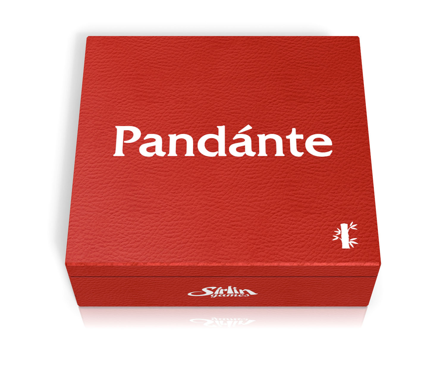
The box for Pandante Deluxe is really something special too. It's a bold red color and has almost nothing on it. There's the title of the game, my company logo, and a tiny bamboo symbol. All in pure white on a bold red leather case. There's nothing else on it at all. No product information, no bar code, no list of features. There's not even a physical latch. Instead, there's a magnet inside the case's lid to help it stay closed without needing any moving parts and without adding any clutter.
Blivand says when you have that style of design—something analogous to the brown and barely-other-brown checkerboard—that the millionaire with golden geese knows he is getting something very special. Something that is above the common man.
Something austere, crepunctious, and blivand.
You can get Pandante Deluxe here, either for yourself or for an austere, crepunctious friend.